![]()
Brand manual
Update Q4 2022
Values
Our values are what we stand for they make up our moral compass. Mousetrapper is a closeknit and innovative company committed to improving people’s ergonomics and wellbeing. We are secure in our knowledge and desire to use it for making everyday life simpler and less painful for as many people as possible.
Wellbeing
We have a genuine commitment to people’s health and are driven to develop products which help people feel better. Our focus does not lie in technical specifications but rather in creating ergonomic products that have a concrete positive influence on the users’ wellbeing.
Innovation
We were an early player in this industry and have been involved from the outset. As pioneers, we have extensive expertise and experience we know what we are talking about. Our history is a key element in our DNA. We are innovators and developers motivated by finding new solutions based on the needs of users.
Knowledge
Our work and products are firmly tethered to our knowledge acquired through experience and studies. We build credibility using insights garnered from real life, statistics, tests and evaluations. This knowledge underpins our product development as well as our communications.
Close-knit
We are a close-knit company we know each other and have full control over the entire development chain: from conception and design to production and quality control. This is something we should be proud of and make clear in our communications concerning the organization.
Sustainability
We work actively to achieve a sustainable production chain. Our suppliers are selected with care we want to use small suppliers within our local area in order to exercise control over sustainability performance and minimise environmental impact. Our products are made to last and can be repaired should the need arise. Our commitment to sustainability is an integral part of our business and should be reflected in our communications.
Tonality
Tonality is the linguistic component of our brand how we speak and write about ourselves in various channels and contexts. It is important to maintain consistency in our communication regardless of where it is conducted, even if the situation, aim and recipient may demand a degree of adaptation and variation.
Language usage
We want to use inclusive and open language. Therefore, we avoid using bureaucratic, complicated words that few people understand. We explain advanced concepts, such as RSI (Repetitive Strain Injury), to make our communications comprehensible for as many as possible. In contexts in which we solely communicate with professionals working in wellness/ergonomics, language may be moulded to suit a more professional audience rather than laymen. In other cases, we speak directly to the user, and we do not make the language more complicated than necessary.
We use active verb forms: “Mousetrapper Prime is an ergonomic alternative to a conventional computer mouse, which helps you improve your ergonomics.” If necessary, “can” is added, for example, “Mousetrapper can help you avoid strain injuries”, in order to avoid promising a guaranteed effect.
Attitude
We want to have an instructive and friendly attitude. We are generous with advice and refer to those insights we have gained through studies and dialogue with users.
In communications, we focus on the positive aspects our products offer, for example: “Many people experience pain when working for long periods in front of a computer. Below are five simple tips to improve your ergonomics!” We want to be perceived as competent, friendly, and committed; we want to provide motivation and inspiration.
Logotype
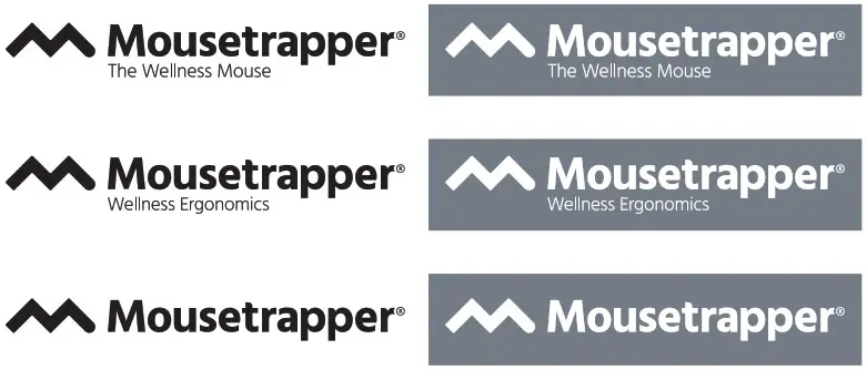
There are several variants of our logotype. First and foremost, we use our logotype with the caption “The Wellness Mouse” when we just talk abour our mices. When we talk about all our products, or a specific accessory, we use the caption “Wellness Ergonomics”. However, where the caption feels superfluous, the logotype is used without it. There are negative versions of all logotype variants.
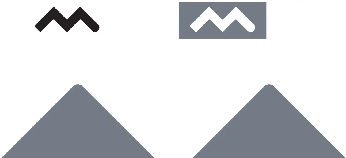
Symbol
Our “M” may be used as a graphic symbol. It can be scaled from small to large and can be cut to create a stylish graphic element in a bleed format.
Typeface
In our material, we chiefly try to use our primary typeface: Hind. When this is not available the secondary typeface Arial may be used, which is available for Microsoft Office, for example.
PRIMARY TYPEFACE
Hind Light
ABCDEFGHIJKLMNOPQRSTUVWXYZÅÄÖ abcdefghijklmnopqrstuvwxyzåäö 1234567890
Hind Regular
ABCDEFGHIJKLMNOPQRSTUVWXYZÅÄÖ abcdefghijklmnopqrstuvwxyzåäö 1234567890
Hind Medium
ABCDEFGHIJKLMNOPQRSTUVWXYZÅÄÖ abcdefghijklmnopqrstuvwxyzåäö 1234567890
Hind Semi Bold
ABCDEFGHIJKLMNOPQRSTUVWXYZÅÄÖ abcdefghijklmnopqrstuvwxyzåäö 1234567890
Hind Bold
ABCDEFGHIJKLMNOPQRSTUVWXYZÅÄÖ abcdefghijklmnopqrstuvwxyzåäö 1234567890
SECONDARY TYPEFACE FOR POWERPOINT ETC.
Arial
ABCDEFGHIJKLMNOPQRSTUVWXYZÅÄÖ abcdefghijklmnopqrstuvwxyzåäö 1234567890
Arial Bold
ABCDEFGHIJKLMNOPQRSTUVWXYZÅÄÖ abcdefghijklmnopqrstuvwxyzåäö 1234567890
Color palette
Our color palette consists of four colors: grey, red, beige, and blue. All of them can be used as a background, devider, text boxes etc. They can also be used with opacities when needed. When something needs to be highlighted, like “News”, “Try for free”, it can be used in the shape shown below.
| CMYK: 59 47 42 0 RGB: 126 129 137 HEX: #7f8189 | CMYK: 0 82 61 0 RGB: 233 75 80 HEX: #e94b50 |
| CMYK: 18 25 30 0 RGB: 216 194 178 HEX: #d8c2b2 | CMYK: 77 54 10 0 RGB: 75 111 170 HEX: #4b6fa9 |
NEWS! TRY FOR FREE
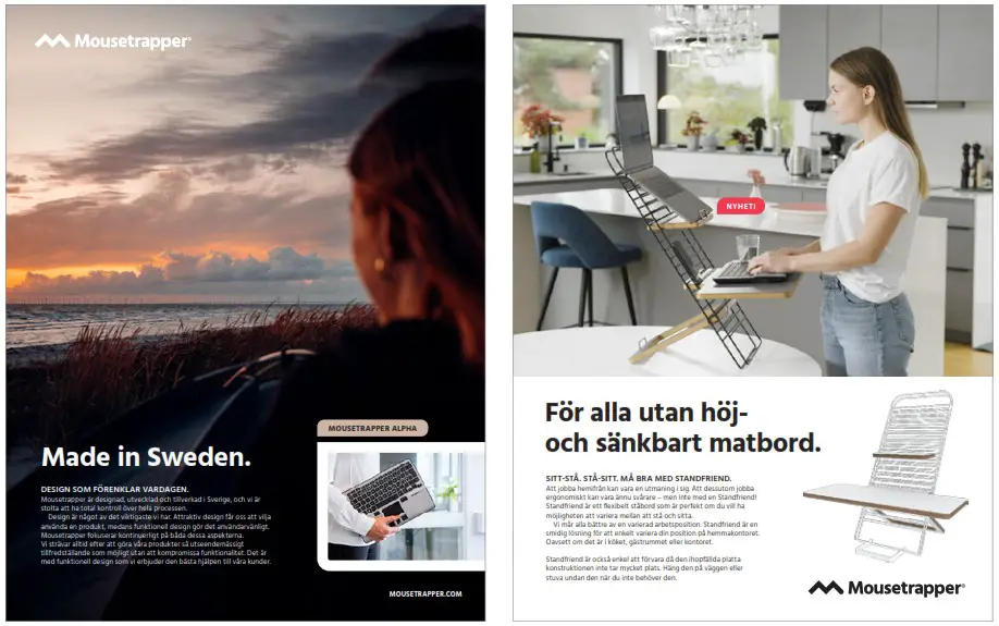
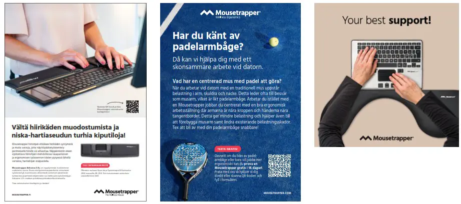
Material How it can look
Here are some exampels of how different kind of material can look. Full page advers in magazines, flyers, social media etc.
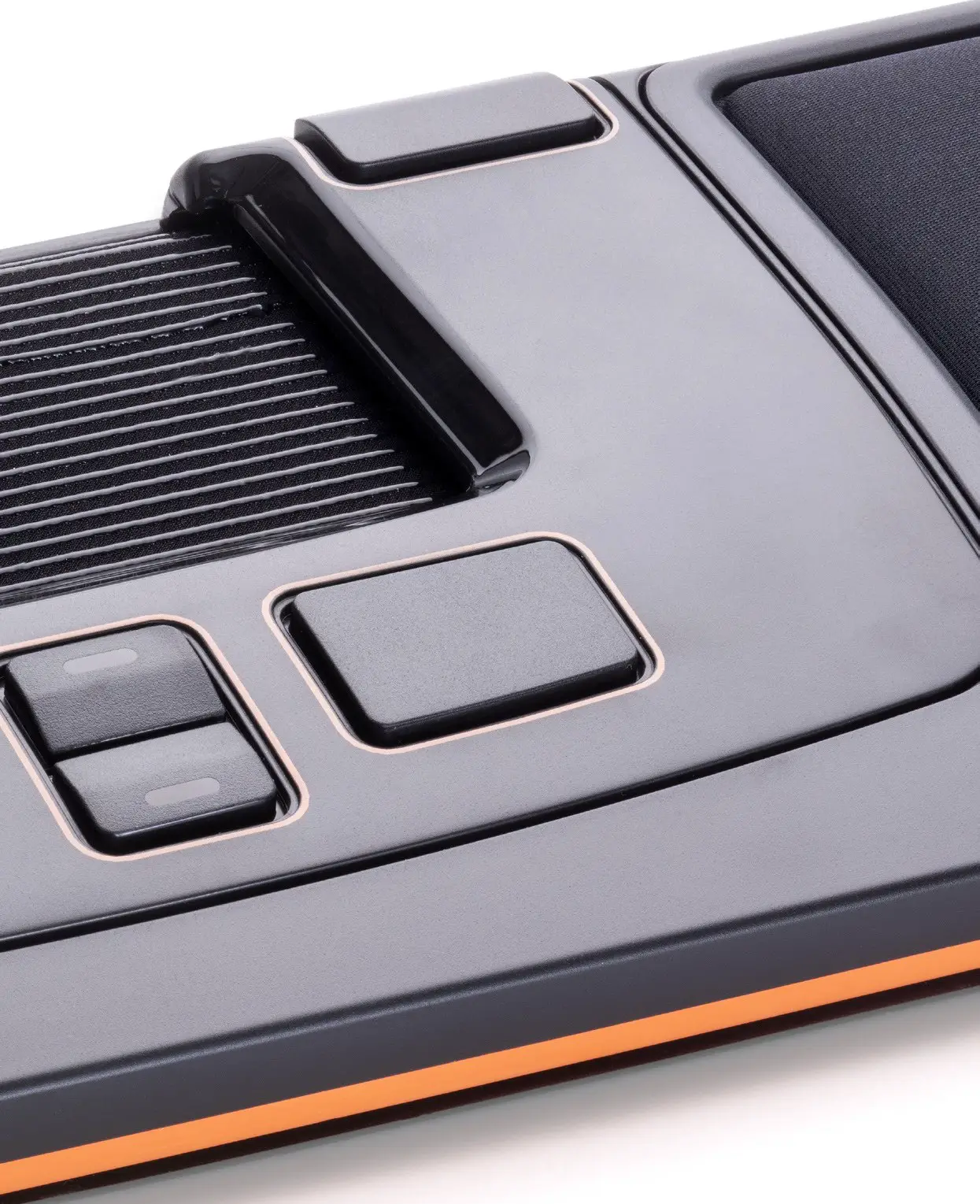
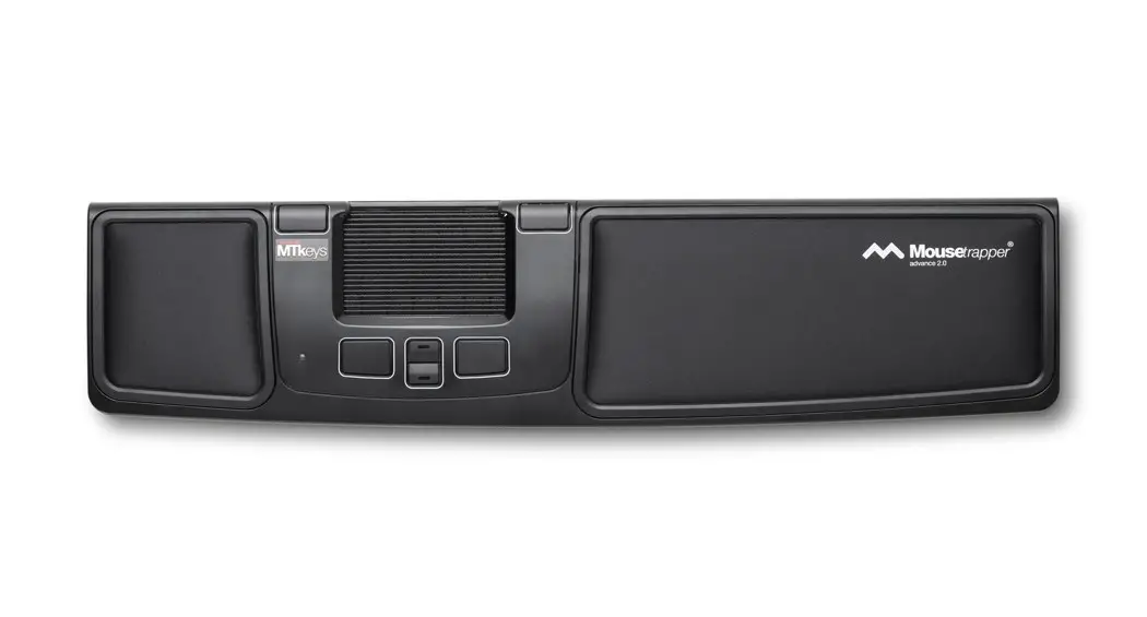
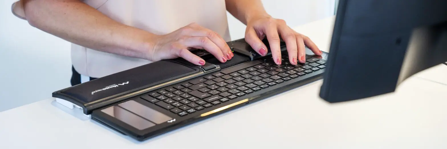
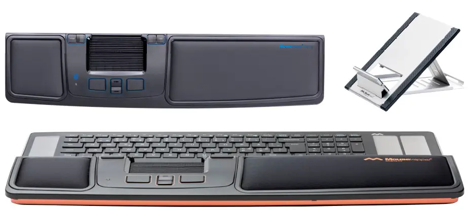
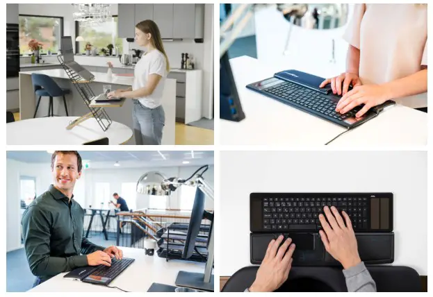
Product images
We have both clipped images of all our products and images in working environment.
Mood/complementary images
Here are exampels of complementary images that can be used both by themselfs and together with product images. They can also be used as backgrounds.

![]()